
Quick Answer
Pantone color matching for custom clothing starts with the right physical reference, but the code is only the beginning. Use a Pantone Fashion, Home + Interiors textile reference, especially TCX, when the target is dyed fabric. Use a Pantone graphics reference when specifying print ink, packaging, or graphic elements. Then approve the actual fabric, print, and trims under agreed lighting before bulk production.
A code alone does not guarantee a production result. Fiber content, fabric construction, dye or pigment chemistry, surface texture, washing, finishing, production lot, and viewing conditions all affect perceived color. Treat each material and process as a separate color decision, record approvals clearly, and compare bulk goods with the approved physical sample rather than with a phone or laptop screen.
Choose the Right Color Reference
Before asking a supplier to match a color, identify what will carry that color. A cotton jersey body, rubberized print, polyester zipper tape, embroidery thread, and coated paper hangtag do not respond to colorants in the same way. The most useful reference is the one designed for the material and production process being approved.
Pantone Fashion, Home + Interiors, or FHI, is the physical textile and apparel direction. TCX refers to colors presented on cotton, so it gives a fabric team a more relevant starting point than a graphics code or a digital value. Pantone’s official overview of color systems for textiles explains this material-focused use.
TPG is intended for pigments and coatings used on products and hard surfaces. It may help when discussing a coated accessory or another non-textile component, but it is not the preferred reference for dyed garment fabric. PMS belongs to the Pantone graphics system. It can guide spot-color ink, packaging, and graphics, subject to the printing process and substrate. The Pantone color systems explanation is useful when checking which family fits a specific application.
| Reference | Best use | What to send | Approval risk |
|---|---|---|---|
| TCX | Dyed apparel fabric and textile color direction | Current physical TCX swatch, full code, fabric composition, and finish | Still requires a lab dip because construction, fiber, and dye behavior can shift the result |
| TPG | Pigments, coatings, and hard-surface product direction | Current physical TPG reference plus the exact coated component and surface description | High if it is treated as the preferred reference for dyed fabric |
| PMS | Print ink, packaging, and graphic applications | Current physical graphics guide reference, ink process, substrate, and artwork | Process and substrate can make a printed result differ from the guide |
| HEX/RGB | Digital briefs, interface files, and quick screen communication | Values plus a physical textile or print reference when production color matters | High when a screen preview is the only approval standard |
| CMYK | Process-print artwork and prepress communication | Profile-aware file, color values, substrate, print method, and physical proof | Output changes with profile, ink set, machine, underbase, and material |
Write the full system and suffix, not just a number. Include the reference edition or physical swatch when possible, because color libraries are revised and similar-looking codes can belong to different systems. Place this information in the colorway pages of a clear clothing tech pack, next to material, wash, print, and trim notes.
Why Screen Color Is Not Production Color
HEX and RGB describe light emitted by a display. Fabric, ink, thread, and paper reflect light. A screen therefore cannot reproduce the physical behavior of a dyed or printed surface. Two calibrated monitors may be close to each other, while an uncalibrated phone with automatic brightness or a vivid display mode may show a visibly different hue.
CMYK also needs context. It describes process-print percentages, but the printed appearance depends on the color profile, ink, machine, substrate, underbase, and finishing. A CMYK value viewed inside a design file is not a universal physical specimen.
Use digital values to locate the intended color and keep design files organized. Do not use them as the final production approval. Before review, agree and record the illuminant or light source for primary evaluation, the viewing environment, and a relevant secondary lighting condition. Ask which physical reference and sample format will be used, then compare that sample under the recorded conditions so later reviewers evaluate the same evidence.
Fabric, Print and Trim Need Separate Color Decisions
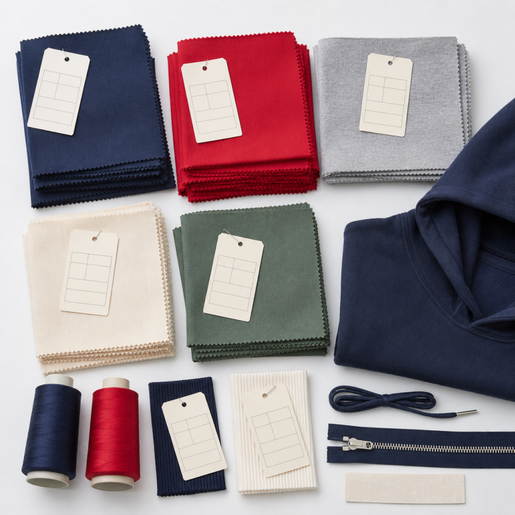
A monochrome garment can contain many materials. The main fabric might be cotton jersey, while the rib uses a cotton-elastane blend, the zipper tape is polyester, and the drawcord has a synthetic outer yarn. Even when every component is described as the same black, red, or green, each fiber and surface may absorb or reflect color differently.
Map the color by component
Specify the body fabric, rib, lining, embroidery thread, zipper tape, drawcord, woven label, care label, transfer label, and packaging individually. State whether each component should match the body, coordinate tonally, or use a deliberate contrast. A visual phrase such as “match body” needs an approved body sample and a defined viewing point.
Prints require their own references because plastisol, water-based ink, discharge, direct-to-garment output, and transfers build color differently. Embroidery thread has sheen and directional texture. Woven labels mix yarns at a small scale, while packaging is evaluated on paper or plastic. The options in this guide to custom labels and packaging are best briefed as separate components, not extensions of the fabric dye instruction.
A capable streetwear manufacturer can help identify which components need lab dips, strike-offs, thread cards, or supplier shade submissions. The brand still needs to state the hierarchy: which component is the master reference, which may be a close tonal coordination, and which is approved on its own merits.
How the Lab Dip Approval Process Works
A lab dip is a small dyed-fabric submission developed before the production fabric is dyed. It lets the brand judge color on the intended fiber and construction. The request should name the exact fabric quality, fiber blend, weight, relevant pretreatment, and planned finish. A dip on a different material may be useful for direction, but it cannot stand in for approval on the actual quality.
- Send a complete target. Provide the physical TCX swatch or agreed master sample, full code, color name, fabric specification, wash or finish, and labeled colorway. If a digital value is included, mark it as supporting communication.
- Review labeled options. The dye team may submit several candidates with distinct option labels. Keep those labels intact. Compare each candidate with the physical target under agreed lighting, and check both a single layer and a folded area because opacity can alter the impression.
- Give specific feedback. Approve one option or describe the direction of correction, such as cleaner, less yellow, slightly deeper, or less saturated. Avoid feedback based only on a phone photograph, since camera processing and the viewer’s screen can introduce another color shift.
- Retain the approved standard. Date and sign the chosen lab dip or document the approval in the agreed system. The brand and supplier should keep corresponding physical pieces, protected from light, moisture, contamination, and mix-ups.
- Compare production material. Evaluate the bulk dye lot against the retained approved dip on the correct fabric and after the specified finishing stage. If several lots are used, identify and review them separately rather than assuming they are visually identical.
A lab dip approval controls a reference point; it is not a promise that every surface will look identical in every environment. Texture, pile direction, fluorescent light, daylight, surrounding colors, and observer evaluation can change perception. Agree on acceptance criteria and escalation steps for the actual project before production decisions become urgent.
How Washing and Finishing Change Color
Garment dyeing, pigment dyeing, enzyme washing, acid effects, snow effects, distressing, softening, and resin treatments can change shade, depth, contrast, hand feel, and surface character. Some effects are intentionally uneven. In those cases, the approval must cover the intended range and placement of the effect, not only a flat color viewed before washing.
Approve color at the stage that represents the product being sold. If the garment will be washed after printing, sample the complete sequence because the wash can affect both the body and the graphic. The practical differences in this garment washing guide help brands name the intended treatment before requesting color development.
Ask whether the first approval is a fabric lab dip, a wash panel, a garment-dye trial, or a finished garment sample. Record water temperature, treatment route, softener or finish, drying method, and any abrasion step that forms part of the approved appearance. Later bulk comparison should use goods that have completed the same defined process.
How to Match Printed Artwork to a Garment
Start by deciding whether the artwork should match the garment body, coordinate with it, or reproduce an independent brand color. Those are different briefs. A body-color print may need deliberate adjustment to appear visually aligned because ink sits on the surface while dye is inside the fiber.
For spot-color work, send clean artwork, name the Pantone graphics reference, and state the print method and fabric color. Pantone’s guidance on the Pantone Graphics system provides context for selecting graphics colors, but the physical strike-off remains the relevant production evidence for the chosen ink and garment.

Account for ink, underbase and substrate
On a dark garment, an underbase can increase opacity and change the final hue. Ink film thickness, mesh, curing, and the fabric surface also influence the result. Review the file preparation points in the screen-printing artwork requirements, then approve a physical strike-off for the actual combination.
Different methods require different evidence. Screen printing can use mixed spot inks and controlled layers. DTG printing builds an image through device profiles, pretreatment, white ink, and process colors. Heat transfer printing adds film, adhesive, surface, heat, and pressure variables. A file that looks the same on screen can produce different results through each route.

Evaluate small text, gradients, opacity, hand feel, edge quality, and color together. If a print contains several important colors, label each one in the artwork and on the physical sample. Keep one approved strike-off with the brand and one with the production team so bulk checks refer to matching physical evidence.
Sample and Bulk Color Approval Checklist
Color approval works best when every decision can be traced to a labeled reference. Use this checklist during development and repeat it when reviewing pre-production or bulk goods.
- Confirm the color system, full code, suffix, physical reference, and colorway name for every important component.
- Verify that each lab dip, strike-off, thread sample, trim card, and packaging proof uses the intended production material and process.
- Review samples under agreed neutral lighting and a second relevant use condition, with surrounding colors kept consistent.
- Compare the finished sample with the retained approval, not with a screen capture, emailed photograph, or memory of the target.
- Check body fabric, rib, lining, zipper tape, drawcord, embroidery, printed artwork, labels, and packaging as separate decisions.
- Review color after the specified wash, cure, press, coating, or finishing process rather than approving an unfinished intermediate.
- Label approvals with option, date, fabric quality, lot or sample identity, reviewer, and any accepted comments or limitations.
- Check more than one area or unit from relevant bulk lots, including seams, folded layers, and components placed beside the body fabric.
- Escalate an unexplained shift before cutting, printing, or assembly makes correction more difficult.
Pair the color review with a broader clothing sample review before bulk production. Fit, construction, measurements, artwork placement, and color interact, so the signed sample should represent the complete product rather than an isolated swatch collection.
Common Color-Matching Mistakes
Sending a code without its system
A number may exist in more than one Pantone family. Always include the system and suffix, then attach or identify the physical guide used. “PMS” should not be used as a catch-all term for textile color.
Approving from a photograph
A photograph is useful for tracking options and discussing obvious direction. Camera white balance, exposure, compression, ambient light, and the receiving display make it unsuitable as the only evidence for final color approval.
Assuming every component will match automatically
Different fibers, textures, gloss levels, suppliers, and production lots can create visible differences. Put each component on the approval map and decide whether the target is a close body match, a coordinated tone, or an independent color.
Approving before the final finish
Dyeing, curing, pressing, washing, softening, and coating can move color or alter surface reflection. Approve the state that represents the finished product and retain that state as the comparison standard.
Losing the physical approval trail
Unlabeled swatches invite confusion. Protect and label the chosen dip, strike-off, trim, and final sample. Written comments should point to those exact pieces so the development team does not reconstruct a decision from email descriptions.
Frequently Asked Questions
Should clothing brands use Pantone TCX or PMS?
Use TCX as the physical textile and apparel direction for dyed fabric. Use PMS from the graphics system for spot-color print ink, graphics, or packaging when that system suits the process. A garment can legitimately use both: TCX for the body fabric and a graphics code for the print. Each still needs approval on the intended substrate.
What is a lab dip in clothing production?
A lab dip is a small piece of the specified fabric dyed as a color-development sample before the production lot. It lets the brand compare candidate shades with a physical target on a relevant fiber and construction. The approved, labeled dip becomes a reference for checking finished production fabric.
Can a factory match a HEX code?
A factory can use a HEX code to understand digital direction and locate a nearby physical reference, but HEX describes display light rather than dyed material. Convert the brief into an appropriate physical textile or graphics target, request a lab dip or strike-off, and approve the physical sample. Monitor settings and fabric behavior prevent HEX alone from serving as final evidence.
Why does the same color look different on fabric and print?
Fabric color is affected by fiber, dye chemistry, knit or weave, texture, absorbency, and finish. Printed color is affected by ink chemistry, opacity, underbase, film thickness, print method, cure, and the color underneath it. Gloss and surface relief change reflected light too, so equal codes do not make different materials visually identical.
How should a brand approve color before bulk production?
Approve labeled physical evidence for each relevant component: a lab dip or finished fabric for the body, a strike-off for print, thread or trim submissions for components, and proofs for labels or packaging. Review under agreed lighting, confirm the final wash or finish, record the decision, retain matching samples with both parties, and compare bulk lots with those references.
Pantone is a trademark of Pantone LLC. Eking Clothing is not affiliated with Pantone and is not certified or authorized by Pantone.
Prepare a Clear Color Brief
A useful brief connects each color to a material, process, and approval stage. List the garment colorways; the fabric composition and construction; the full physical color references; the print method and artwork values; the rib, zipper tape, drawcord, thread, label, and packaging decisions; the wash or finish; and the samples the brand expects to review. Mark which approved sample becomes the master for bulk comparison.
Also name the decision-makers and explain how feedback will be recorded. Specific comments tied to labeled samples are easier to act on than requests to make a color “more premium” or “exactly like the screen.” A disciplined approval trail helps the brand and production team make the same comparison at each stage.
To turn an existing palette into a production-ready brief, send the material list, artwork files, intended color references, wash details, and required sample stages through the Eking Clothing project contact form. The practical next step is to identify one physical master reference for each application, then request and retain the appropriate fabric, print, and trim approvals before bulk work begins.

